Color & composition
Seasonal Color Palettes in Landscape Photos: A Practical Guide for 2026
Seasonal Color Palettes in Landscape Photos unlock the clarity you need to plan, shoot, and edit landscapes that reflect the true mood of each season in 2026. Well break down how to spot, organize, and reproduce those color stories with confidencefrom field notes to final edits.
Key Takeaways
| What youll gain | Why it matters |
|---|---|
| A clear framework for recognizing eight seasonal moments | The Wheel of the Year concept helps you anticipate palette shifts in landscape scenes |
| Practical shooting tips aligned with palette goals | From white balance to exposure decisions, youll tailor captures to seasonal color stories |
| Guided post-processing to preserve or shift palettes | Color grading becomes a tool for mood, not a trap of over-saturation |
| Texture and palette extension with licensing-ready stock assets | Tap into 8K textures with clear buyer licenses to scale your prints and merch |
| Structured decision points for composition and timing | Resolve color conflicts early, so your landscapes read as seasonal and cohesive |
To ground this in real-world practice, well blend field-tested methods with reliable references from 2026 content that explore Seasonal Color Palettes in Landscape Photos and Wheel of the Year concepts. For example, our look at the Wheel of the Year helps you understand eight turning points that reshape a landscapes palette, while the seasonal-focused pages on Seasonal Color Palettes in Landscape Photography guide practical application across the year.
Well also show how to access high-quality, licensed textures to extend a palette into large-format prints and installations. Our examples pull from textures and licensing options that are designed for designers and photographers working with large-output media in 2026.
What Seasonal Color Palettes Mean for Landscape Photography
Seasonal color palettes in landscape photos are not about chasing a single perfect moment. Theyre about recognizing recurring color trajectories as the year turns. In 2026, we see palettes that move from fresh spring greens into sunlit summer heat, then into autumns ember tones, and finally into winters quiet blues and grays. By naming these palettes, you can plan shoots that feel intentional and cohesive across a collection or series.
Colin-influenced palettes emerge when you observe how light, temperature, and humidity shift color perception. A meadow after rain may lean toward cooler greens with turquoise accents, while a dry late-summer hillside glows with warm ochres and violets. The seasonal color language is not just about foliageit includes sky color, distant hills, and even man-made cues like weathered fences or stone walls.
To get practical, start by scouting landscapes during each season and listing the dominant hues you observe. Pair those hues with the eight-season framework so you can predict which color combinations will feel authentic in 2026. For more depth on the wheel approach, explore our Wheel of the Year resources and the main Seasonal Color Palettes page linked above.
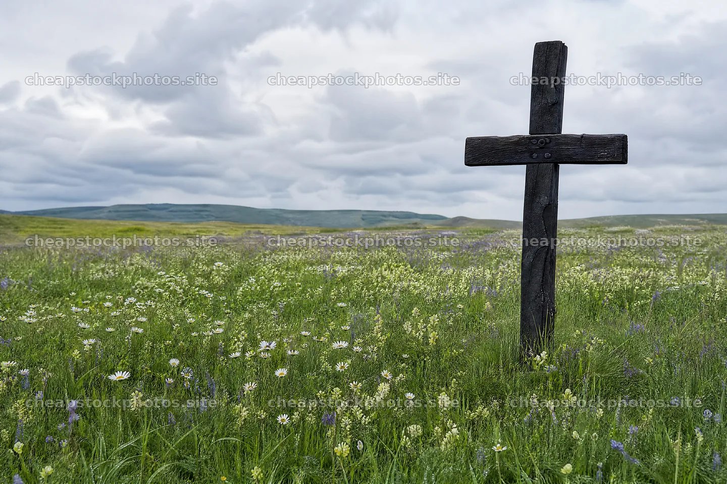
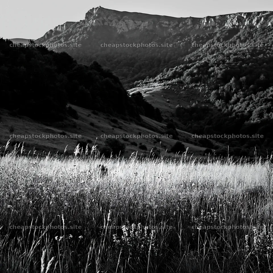
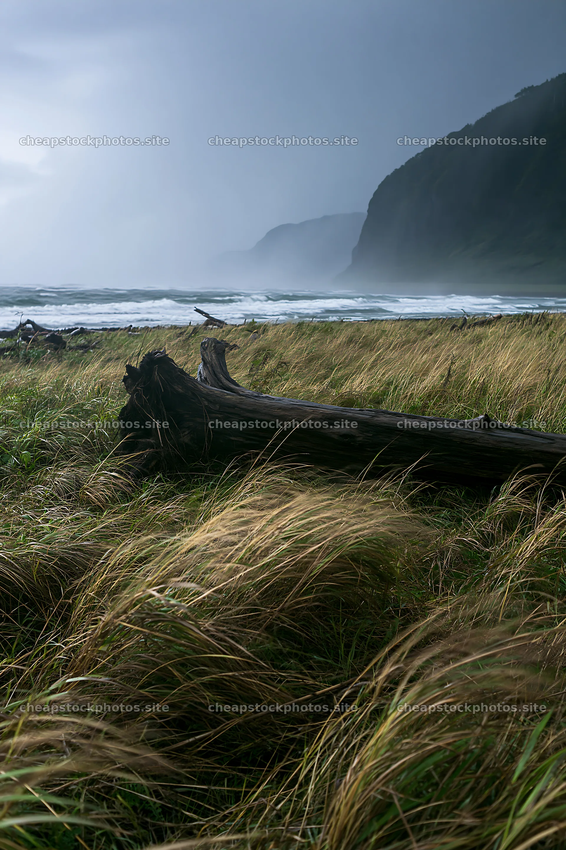
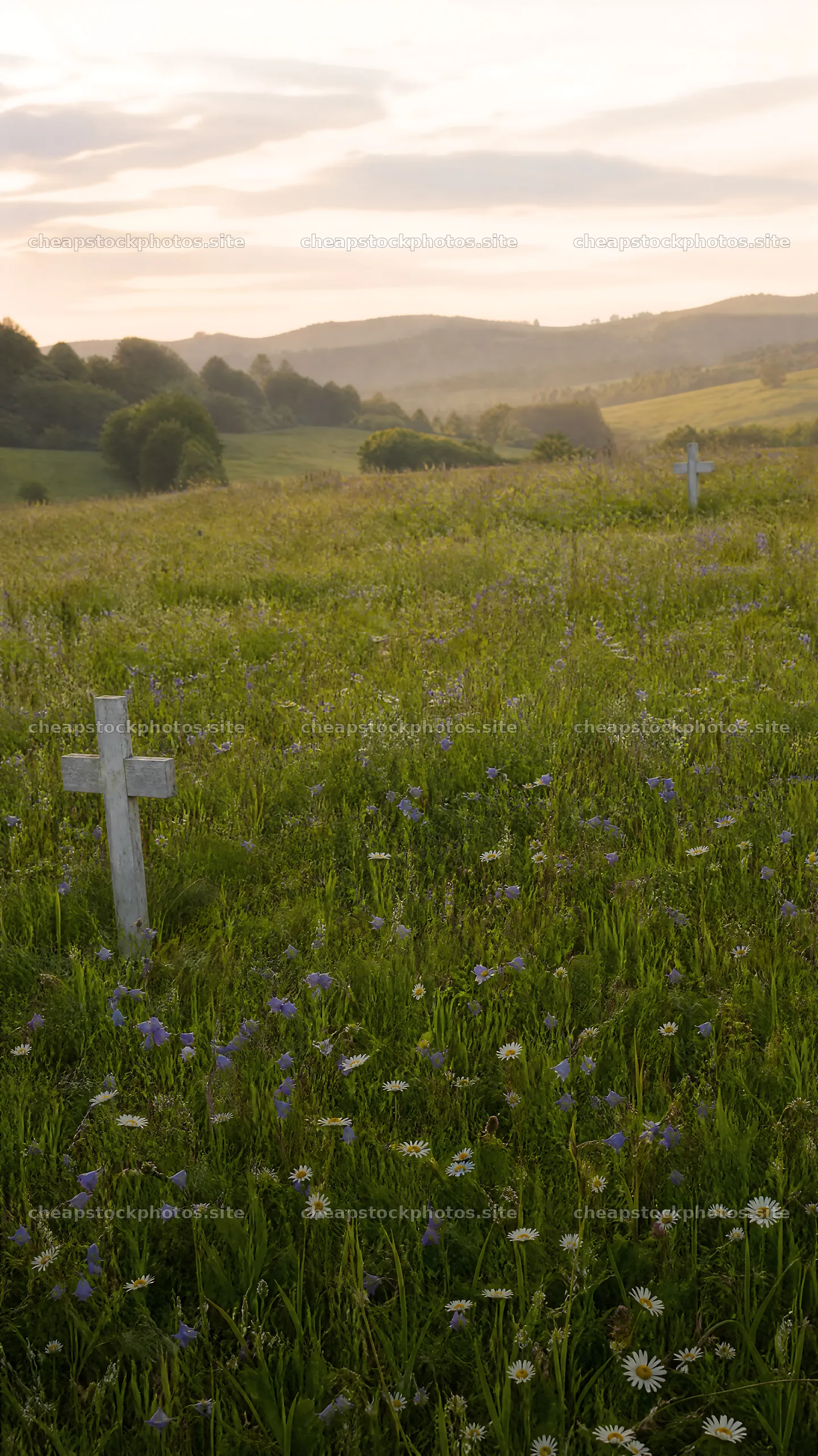
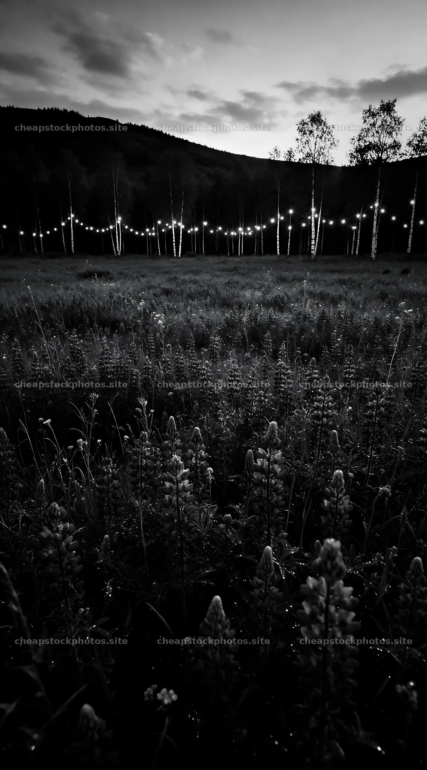
Images can tell a palette story quickly. The stock-photo collection used for reference includes high-resolution meadow scenes that illustrate how color shifts appear in real scenes. Here are a few visuals that help anchor palette decisions in the field:
Observing Seasonal Color in Real-World Landscapes
Our field practice starts with observing color patterns as they actually unfold in nature. In spring, youll notice fresh greens with a hint of yellow from blossoming trees and early grasses. In summer, the palette often shifts toward saturated greens, blues, and warm sunlight. Autumn brings a fire of oranges, reds, and muted browns. Winter emphasizes cool blues, pale grays, and the desaturated greens that remain in evergreens.
To work with these shifts, we recommend a simple routine: walk the landscape at the start and end of golden hour, record the dominant hues, and note how light changes texture and color. This routine helps you build a palette mentally before you press the shutter, and it supports consistent post-processing decisions later.
For a deeper dive into the seasonal framework, we link to resources that explore the Wheel of the Year and year-round palette planning. You can see how the eight seasonal moments influence color choices, especially when planning a multi-location shoot across seasons.
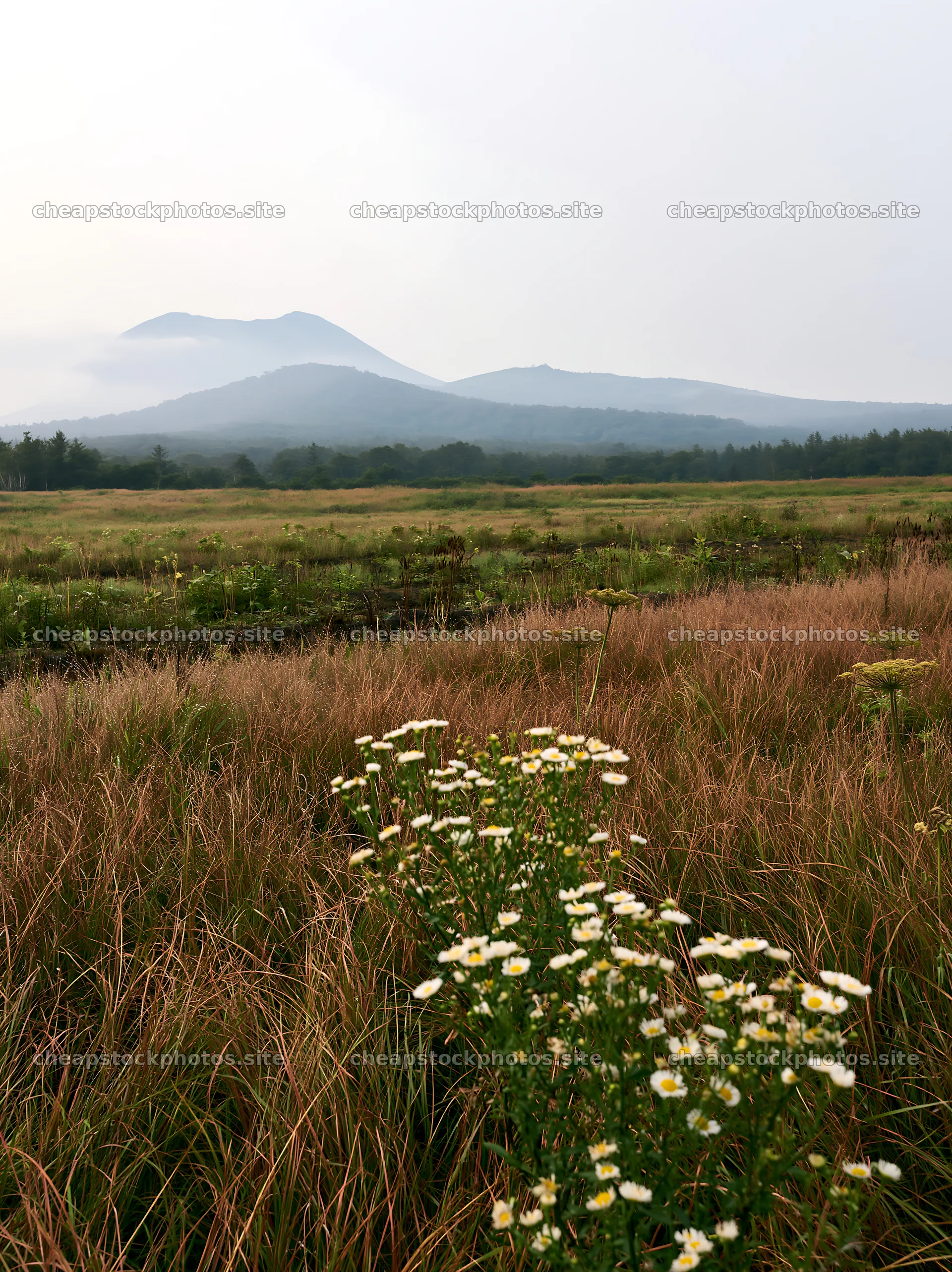
Images can demonstrate these shifts clearly. Consider a meadow at dawn in spring, where pale greens mix with early yellows, or a late-summer hillside where ochre foothills meet a cool blue sky. The goal is that your landscape photos carry a color story that matches the seasons mood.
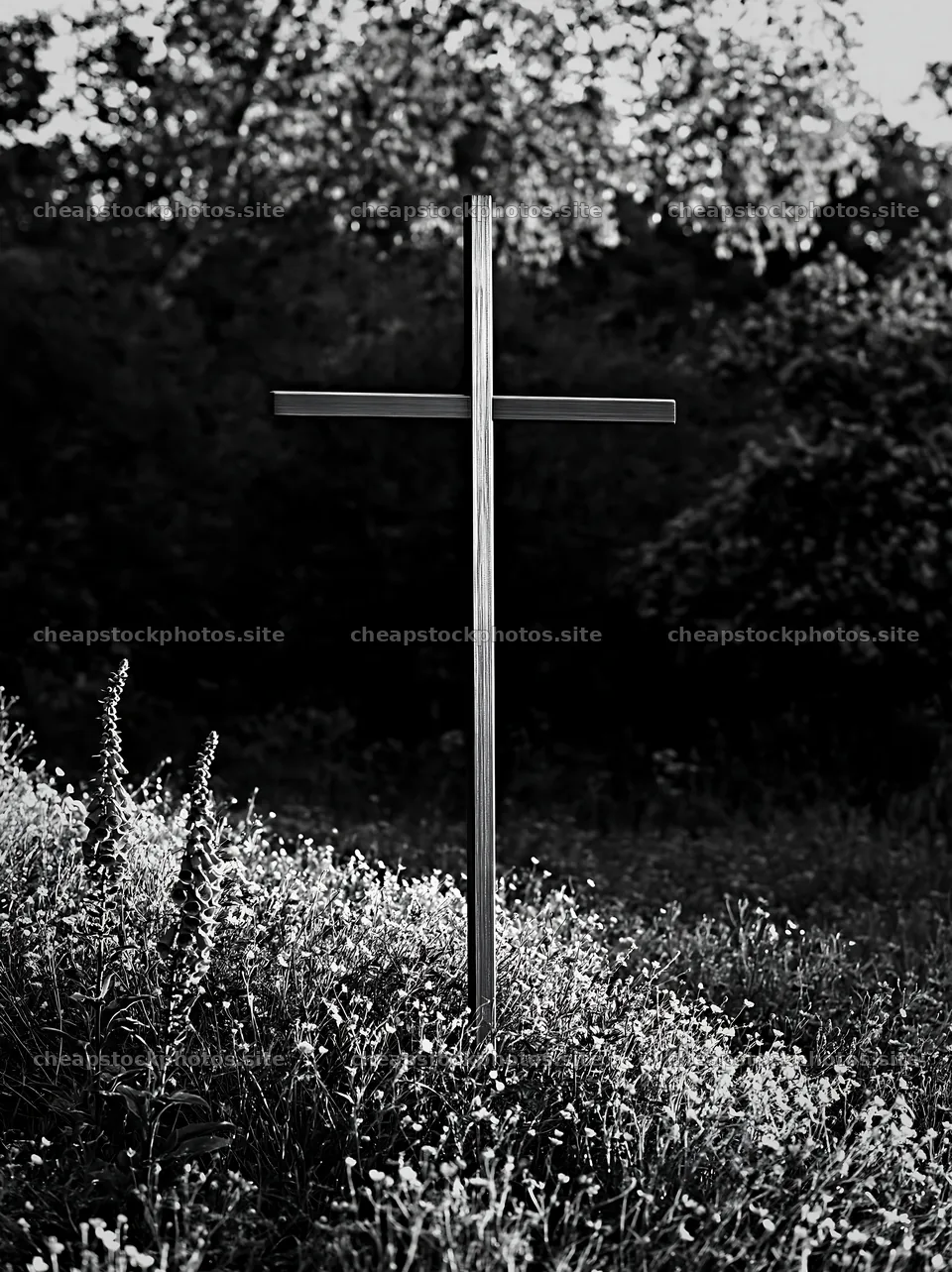
Below is an image that helps illustrate a palette moment in the field:
Planning Tools and Techniques for Palette-Driven Shots
Planning is where knowledge becomes action. We begin with a practical toolkit to help you map out Seasonal Color Palettes in Landscape Photos before you shoot. Start with a seasonal color sketch: note the main hues, their saturation, and how the light might shift them as the day progresses.
Color wheels and swatches are quick aids, but your camera settings should align with your palette goals. Shoot RAW to retain gradient information, and use white balance as a cooperative tool rather than a constraint. For example, a Green-leaning palette might benefit from a slightly cooler white balance to preserve the vibrancy of spring foliage without oversaturating greens.
When shooting for a Wheel of the Year-inspired sequence, plan a shot list that alternates between palette-dominant scenes and supporting contexts (textures, sky, water) that anchor the season. This approach keeps your series cohesive while allowing color shifts to remain believable.
We also consider licensing and texture options for extending palettes into large formats. The High-resolution Photos marketplace offers 8K textures in Free, Standard, and Premium licenses, with seam-checks designed for seamless tiling across walls and textiles. This is particularly useful when building gallery walls or large prints that rely on color continuity across panels.
Example textures and licensing details are described on the licensing pages, which clarify what is allowed per buyer for multiple projects and how to apply textures in print and packaging contexts. Our guidance emphasizes practical licensing for long-term projects rather than abstract permissions.
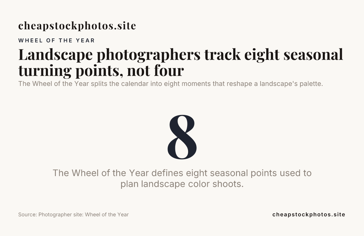
The Wheel of the Year splits the calendar into eight moments that reshape a landscape's palette.
Post-Processing to Preserve and Enhance Palettes
Post-processing is where you finalize a Seasonal Color Palettes in Landscape Photos. Start by rating and organizing your RAWs by palette category. Use targeted color grading to reinforce the season, rather than chasing a universal look. For spring palettes, you might boost yellows and greens with a light lift to warmth; for autumn palettes, emphasize reds, ochres, and muted greens to echo fallen leaves.
Try selective adjustments to maintain natural transitions between sky, land, and water. Avoid over-saturation that can flatten the scenes mood or create color halos at edges. The goal is to preserve a believable season while achieving a polished finish that works across your portfolio.
Texture-backed outputs can extend palette storytelling into large-format displays. As noted in the licensing and texture sections, 8K textures can tile cleanly, enabling walls and installations that read seasonally across panels. This practical approach keeps your work cohesive from field to finish.
Adding a few stock textures to a project is common practice in 2026. For example, you can layer a subtle 8K texture to add micro-patterning in a meadow scene without distracting from the main palette. This technique is part of the practical toolkit that supports Season Palette-driven landscape photography in our workflows.
Case Studies and Brand-Forward Examples
We draw on brand-focused references to show how palette discipline translates into real-world outputs. Our season-focused content on Seasonal Color Palettes in Landscape Photography and the Wheel of the Year pages provide concrete demonstrations of palette-driven approaches. These resources help you align color choices with seasonal narratives rather than isolated scenes.
In addition, exploring the wheel-based content, such as Landscape Photography Wheel of the Year, supports a consistent storyline across a series. The Imbolc, Ostara, Beltane, and Samhain topics on the site offer seasonal prompts you can translate into camera-ready shoots and edit decisions.
If youre collecting assets for a seasonal project, the stock photo library provides a mix of Free, Standard, and Premium licensing. This setup lets you prototype layouts and test color balance before committing to larger print runs or installations. The licensing pages on Cheap Stock Photos explain the boundaries and the flexibility of per-buyer licenses for long-term image use.
Finally, consider how to integrate these palettes into your audience-facing work. A well-curated seasonal series can function as a narrative arc for a gallery, a calendar collection, or a large-format installation. The palette discipline helps viewers move naturally from one season to the next in a cohesive visual journey.
Using Stock Textures to Extend Palettes Across Media
Stock textures are not decorative extras; they are practical tools for maintaining palette integrity in large formats. Our texture marketplace reference guides show textures that pair with your landscape color stories and support seamless tiling for wall murals or textiles. The licensing tiersFree, Standard, Premiumgive you predictable options for different scales of production. When choosing textures for a seasonal series, select ones that complement the palettes temperature and saturation without overpowering the scene.
For readers assembling multi-location shoots or wall installations, textures can provide a unifying substrate that echoes the seasons mood. The textures are designed to be edge-verified for clean tiling, making them reliable partners for large prints and installations in 2026.
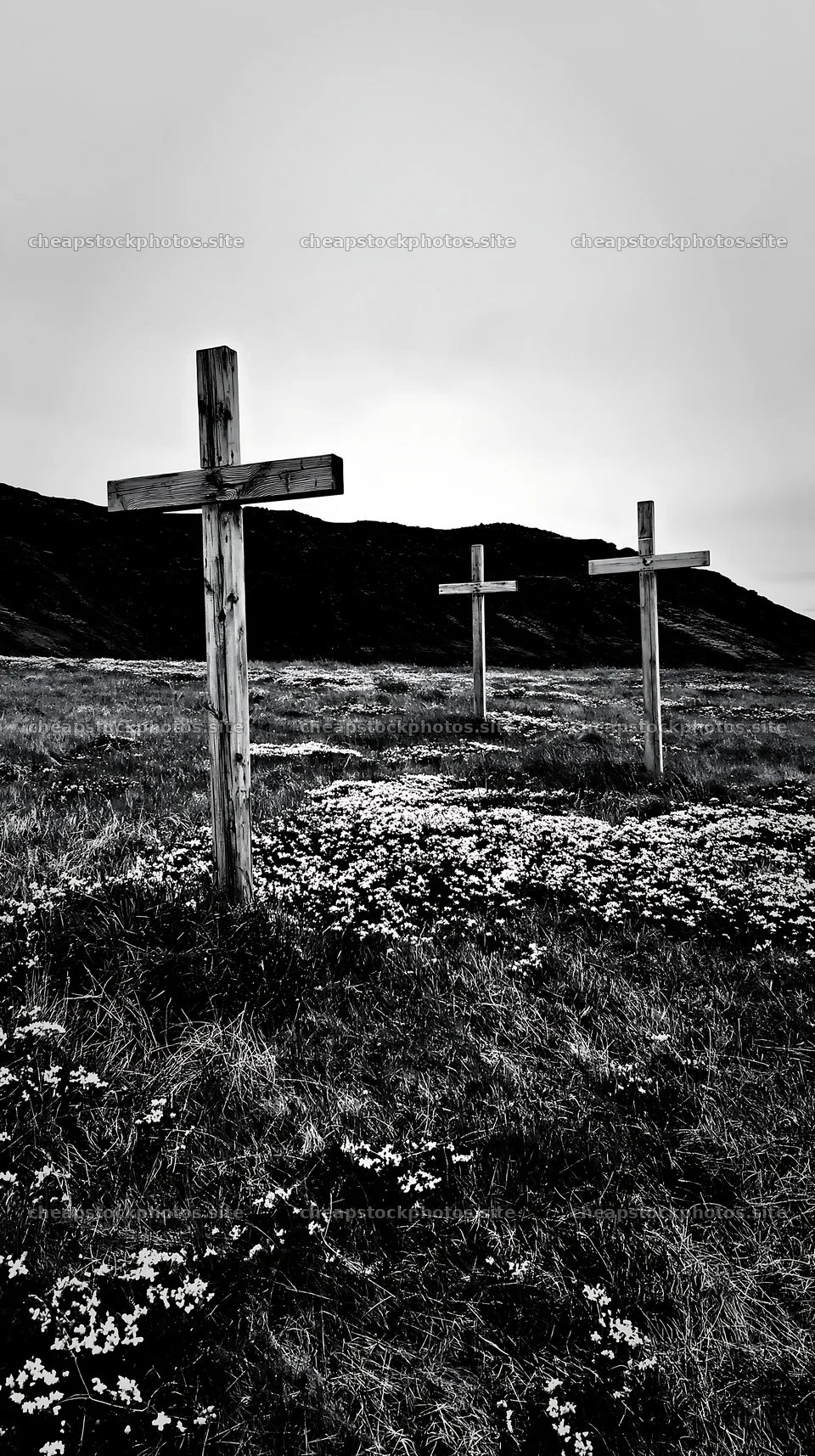
Practical DIY Checklist: Build Your Seasonal Palette Toolkit
- Identify the eight seasonal turning points and map them to your local climate and light patterns. Use the Wheel of the Year as a guiding framework.
- Capture field notes of dominant hues, then test white balance and exposure to preserve color reality across the season.
- Organize your RAW files by palette category during post-processing to streamline edits across a series.
- Experiment with targeted color grading that enhances mood without sacrificing natural color cues.
- Leverage texture assets for large-format projects, ensuring licensing aligns with your production needs.
Conclusion
Seasonal Color Palettes in Landscape Photos provide a practical, repeatable approach to capturing landscapes that feel true to the time of year. By combining the Wheel of the Year framework with disciplined shooting, careful editing, and licensing-ready textures, you can craft color stories that are both beautiful and shareable in 2026. Our method stays grounded in real-world practices and clear licensing terms so you can deliver consistent, seasonally authentic results across formats and media.
Frequently Asked Questions
What exactly are Seasonal Color Palettes in Landscape Photos?
Seasonal color palettes are organized sets of hues that reflect the typical colors of each season in a landscape. They guide how you shoot, edit, and present landscapes to evoke a particular season in 2026.
How do I start identifying palettes in the field?
Begin with a quick survey of dominant greens, blues, and warm tones. Note how light shifts during golden hour and how sky color interacts with land. Use these observations to assign palette goals for the shoot.
Is the Wheel of the Year relevant to contemporary landscape photography in 2026?
Yes. The eight seasonal turning points help you anticipate color shifts and plan sequences that feel cohesive across a series, especially when shooting across multiple locations.
What about licensing for stock textures and textures for print?
Licensing offers Free, Standard, and Premium tiers. Choose based on project scale and distribution. Textures are designed for seamless tiling and large-format use, with clear restrictions on redistribution of the unchanged source file.
Are there recommended tools for color grading seasonally?
Yes. Use RAW workflow, selective color adjustments, and palette-specific grading presets that preserve natural color cues while enhancing seasonal mood. The goal is to support the season, not overpower it.
Can I apply these ideas to a multi-location year-long project?
Absolutely. Map each season to a location with palette-affine characteristics, then use a consistent post-processing approach to ensure narrative continuity across the year.
Where can I find more information about Seasonal Color Palettes in Landscape Photography?
Our core resource is the Seasonal Color Palettes in Landscape Photography page, along with Wheel of the Year content. You can also explore the related Imbolc, Ostara, Beltane, and Samhain posts for seasonal prompts and practical tips.